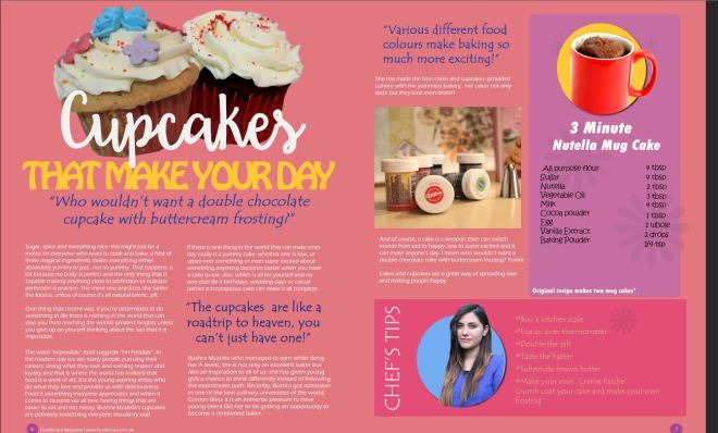
The double spread page was a challenge. To make the double spread look attractive for the audiences i had to experiment a lot because at first I wasn’t happy with it at all but then the graphic elements and side columns made it look a little like what i wanted.
The first few steps were something like this:

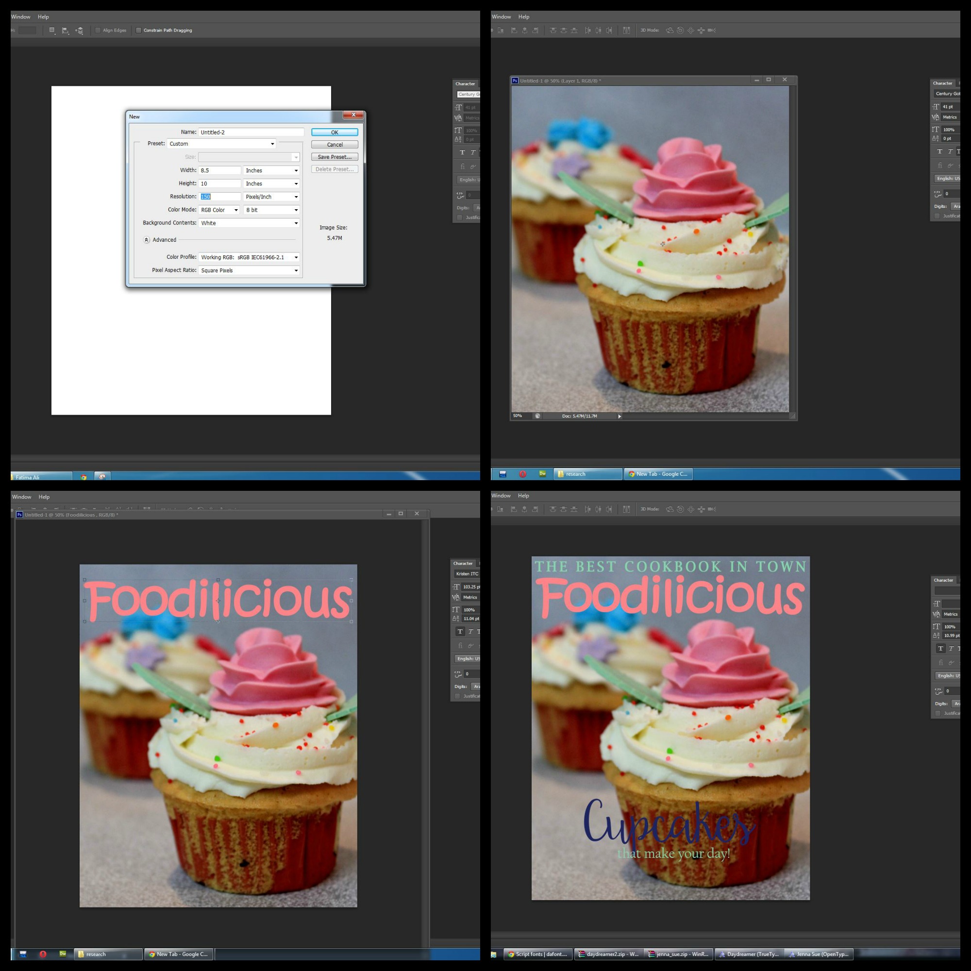
I was sure of how i was going to place the text on the double spread page but in the beginning I wasn’t very sure of how i would place the images and other graphic elements. Experimenting with the page continued for quite a few hours and this is the basic i came up with- using cupcake cutouts instead of the whole picture gave it a very cute look instead of placing the whole picture which made it look very untidy.

Changing the fonts, adding the pull- quote and similarly color graphic boxes made the page appear to be colorful and gave a very comfortable look overall. I even asked a few people verbally, whether they would want to read this magazine page or would they just skip it because it doesn’t attract them. I got a good response and I felt that this would be a good way to have an insight about what the audience has to say. For me graphic elements were a winner, they add life to the page and anything that attracts consumers is something that is perfect for marketing.
The first draft of the final product is shown below:
 Since i wasn’t very happy with my photography i tried my best to cover up the laws by using cutouts of images, graphics, textured background and minor picture editing so i could have a better outcome of the final product.
After some more research and discussion with my media teacher i realized that there were definite issues that could be countered using photoshop. While creating the double spread page I realized, I did not pay attention to where the page is to be folded to close to magazine; and hence in my current structure the text would have been cut.
Also, my teacher showed me some real media examples of sample double spreads and I felt like even though there were a lot of graphic elements in my page, I could have a more simple approach to it along with the graphics by removing the unnecessary textures in the background and also changing the placement of “Chef tips” and the graphic cupcakes etc.

Firstly, I added the margins to the page so I know exactly where I need to place the text box and the graphics; this is a mistake I made in my first draft and was determined to make the page look better.

I also removed the texture used on the background and figured that without the texture it looked subtle and fresh. Having the cupcakes behind the title gave it an overall interesting look giving me more space in the bottom right corner to utilize.
Sorting out the margins made it easier for me to align the text and the graphic bars on the side- giving a more professional and easy to read look to the entire page. Instead of directly placing the quote under the subtitle, I added it in the middle of the paragraph so the audience would have more interest in reading what it’s all about.
The final look of my double spread page was this:
I was pretty happy with the way it looked by the end of the second draft, a lot more vibrant and colorful, perfectly depicting the genre of the magazine and the colors dominated the entire outlook.
 Since this was the first time I was using most photoshop tools, this what I came up with although I felt like I could have done an even better job if I had some more knowledge of the tools but a major issue was that I was being very restrictive with my creativity. I didn’t want to over- do it but at the same time I didn’t want it to look unattractive either.
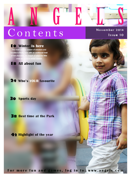 The use of the blur tool is evident in this, so the contents can be easily read also focusing on the male star child. The content page has similar colors overall creating a sort of symmetry within the stencil.


 While I did some extensive research for my media magazine project I realized this page was not as attractive as i thought it would be, most food magazine pages whether cover, content or even double spread pages are with plain background colors with not a lot happening on the page which is what makes them unique and attractive to look at. I looked at the various conventions and eventually tried to follow them-
 using the general format of contents, by having the heading and a little detail about the article, I decided to revise it with more graphical effects instead (adding an image and its heading below). The style of the boxes was done using the rectangular and circular shape tool. Both the tools were masked together and the image was placed on it, making it attractive and something that would attract people. This idea was inspired by how most cupcake holders are shaped like that and it kind of symbolises the genre of the magazine very clearly.