Towards the end of the year our main motive was to finish our media magazine for which we had been learning various conventions and even practiced them for our preliminary task.
The media magazine took a good amount of time to be completed especially since it has to look worthy of getting a good grade. The genre i chose was food because it felt as if i could really relate to it since.. it’s food and everyone loves food whether sweet or savory. For the cover page the image i chose was:

This picture was the best one out of all of them, personally I wasn’t very happy with my photography and the camera angles I used weren’t up to the mark but I somehow managed to make the cover page look comparatively better than what i expected it to look like. The making of the cover page was like writing a story in different phases, chipping in different ideas and recognizing the target group and who would be represented by the magazine which was mostly bakery chefs. 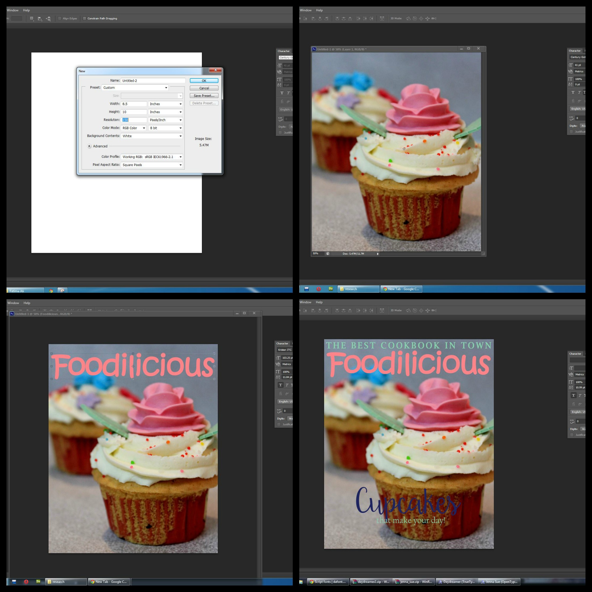
These were the steps of the making of the magazine cover. Choosing the color palette was the trickiest and making sure what looked right was important.

Photoshop does have a lot of font options to choose from but I wanted to choose something different in order to give my magazine a classy yet a really professional look, also since I was enjoying my work so much I felt like going into the depth and finding out various ways to make the magazine look better. I used new fonts from http://www.dafont.com.

To make the magazine look a bit different instead of having the cover- lines written in a normal font I thought I Should add a graphic touch to it so it looks colorful and interesting. I used the shape tool to make a puff and added a gradient to it making it vibrant and attractive.
The final cover looks something like this:
 The strips, puffs and the colors added a great touch to it and made it look colorful- Everyone loves food and for the magazine to be picked up without second thoughts it has to look attractive and this was my try.
